The Importance of Color in Interior Design
One of the most important and crucial things I do as an interior designer is choose the right color scheme and palette for each job. Color can totally change a room by evoking certain feelings, defining the style, and connecting all the different parts and pieces. With my many years of experience, I’ve learned how to carefully pick color schemes that make my clients’ ideas come to life while also making places that look good, work well, and are well-balanced.
Understanding Client Preferences
Before I choose colors, I have a long talk with my client about how they want the room to look and feel. Are they going for something exciting and bold? Calm and peaceful? Feeling cozy and close? Stylish and high-class? I ask them what colors they like, how they want to use the room, and what style they have. The way we talk about it helps me decide whether I want to use a warm, cool, or neutral color scheme as a base.
Considering the Space
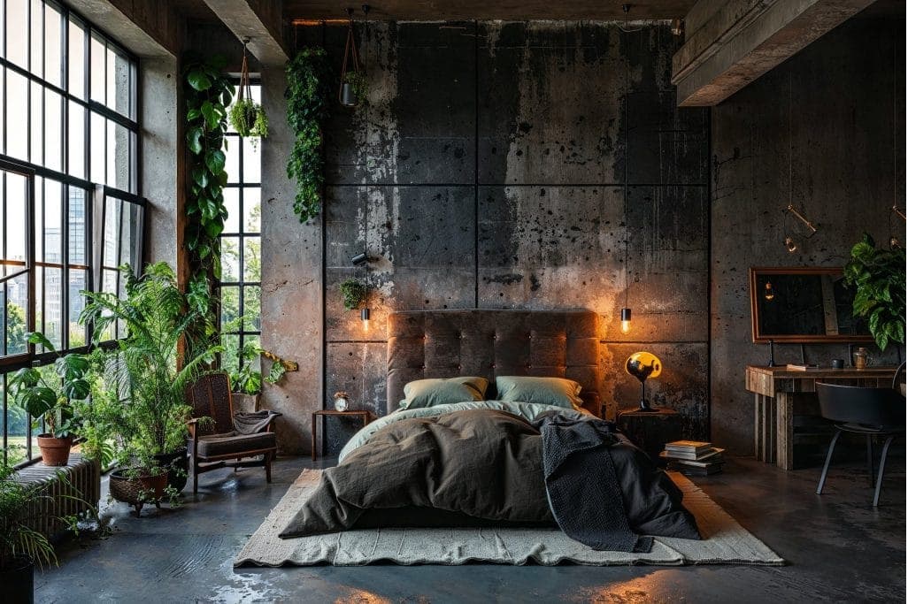
In addition, I always think about the space itself, such as the room’s size, the amount and quality of natural light, the building’s details, and the rooms and areas next to it that can be seen. Deep, saturated colors will make a small, dark room feel even smaller. On the other hand, those bright colors will look great in a big, well-lit room. To find colors that will go with expensive things like the fireplace stone or brick, the kitchen counters and cabinets, and the flooring, I look at the shades in those things.
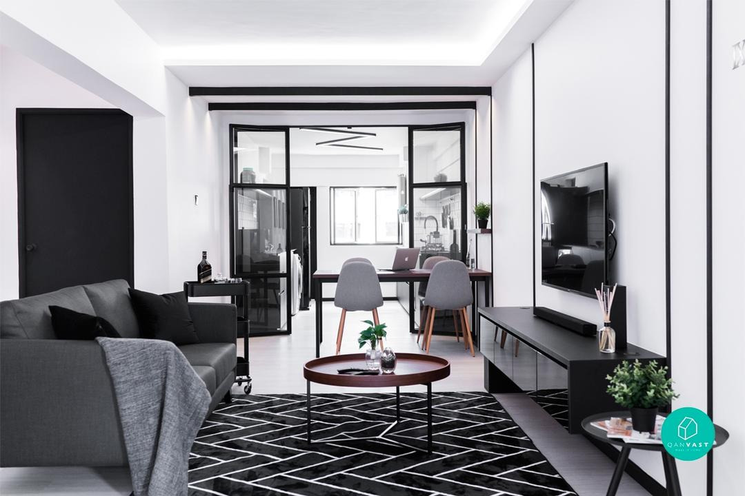
Choosing the Color Scheme
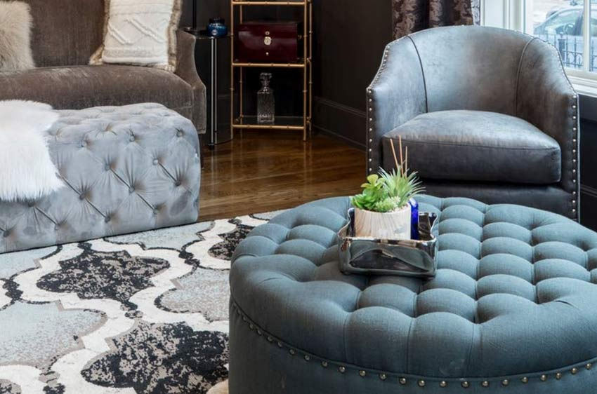
With those key ideas in mind, I start to put together the color scheme. Usually, I pick three to five main colors. I choose a monochromatic scheme, which is different tones and shades of one main color, when I want to make a place feel calm and relaxing, like in my bedroom or bathroom. Like blue and green, complementary color schemes use colors that are next to each other on the color wheel. They are also a beautiful way to add a bit more depth and interest to a calm space.
Using Complementary Colors
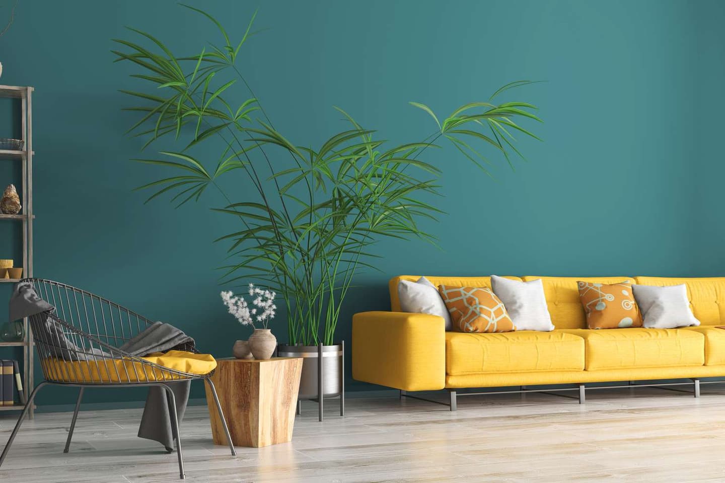
When I really want to turn up the energy and visual effect in a room, I use colors that are opposites on the color wheel, like blue and orange or purple and yellow. When used carefully, complementary plans are great for making a strong point. I also like a split complementary design, in which I pick one main color and then the two colors that go with it. It’s a great way to add more than one color without changing the overall look.
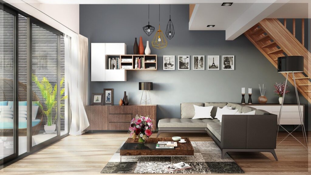
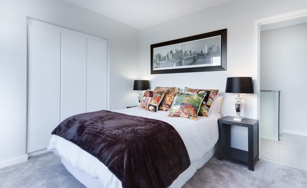
Distributing Colors in the Room
I think about how and where to spread those main colors around the room once I’ve chosen them. Neutrals are always a big part of my palette because they give the eye a place to rest and keep it steady. For example, in the living room, I might choose a warm white for the walls and a linen color for the big furniture pieces. Then I would add accent colors through art, pillows, window treatments, and other small items. The space stays lively and interesting with these pops of color.
The 60-30-10 Rule
I also really like the 60-30-10 rule, which is an old rule in interior design for making sure that colors look good together. The plan is to use one main color for 60% of the scheme, a secondary color for 30%, and an accent color for the last 10%. It’s a great way to make sure that your color schemes are always right, with the right amount of each color.
A neutral color is often the main color and can be found in things like the walls, floors, and big pieces of furniture. You can see the secondary color in window curtains, accent furniture, or a big area rug. It’s still used a lot, but not as much as the main color. And finally, the accent color is what makes art, throw pillows, decorative items, and other pieces complete. It’s a method that works every time.
Using Mood Boards and Digital Tools
I also always make real mood boards with pictures, paint swatches, and fabric pieces so I can see how my plans look in person and make changes as needed. You can feel the magic when you see those colors and materials together in real life. Digital tools are also very useful. For example, I love using Photoshop or apps like Pantone Studio to try out different arrangements and sizes and to share my ideas with clients and workers.

I am a design enthusiast that loves writing about the latest trends and style when it comes to commercial and residential interior design. I also love architecture and buildings.