Convenience store interior design turns quick trips into reliable revenue by making every square meter work harder. Ark & Mason aligns layout, lighting, and merchandising so shoppers navigate intuitively, discover more, and buy with confidence. This article explains what matters, why it lifts sales, and how to implement ten practical ideas. You will get clear definitions, useful examples, and a blueprint you can adapt to single-site or multi-store rollouts without disrupting daily operations.
Highlights
- Layout efficiency: Shorter paths raise conversion and units per basket.
- Impulse mastery: Queue rails and endcaps systemize add-ons with measurable lifts.
- Lighting strategy: Layered illumination spotlights premium, boosting perceived product value.
What Is Convenience Store Interior Design
This section defines the discipline and clarifies its boundaries within retail planning. It explains how layout, fixtures, lighting, signage, and planograms coordinate to create journeys that feel fast, safe, and consistent while increasing exposure to profitable categories.
Convenience store interior design is the orchestrated use of space planning, fixture selection, lighting layers, and communication systems to guide shoppers from entry to checkout with minimal friction. It balances speed and discovery through clear sightlines, intuitive adjacencies, and consistent planograms that keep top sellers in reach. It also sets standards for comfort, safety, and accessibility, ensuring wide aisles, camera-friendly visibility, and clean maintenance pathways. Done well with help of the Ark & Mason team, it improves conversion, units per basket, and queue flow across different footprints.
- Sightlines first: Reveal priority categories from the entrance for orientation.
- Simple paths: Use clear loops that reduce backtracking and confusion.
- Consistent standards: Apply repeatable rules that scale across locations.
See more: 10 Best Interior Design Firms in Canada Leading the Industry
Top 10 Convenience Store Interior Design Ideas
The following ideas translate strategy into action for convenience retail. When calibrating layout, adjacencies, and fixture choices, benchmark against reputable interior design services to align sight lines, lighting layers, and circulation with shopper behavior. Each move is specific, testable, and sized for typical footprints, budgets, and staffing models.

Treat these ideas as modular upgrades. Start by piloting two or three in one store, measure the impact on conversion and attach rate, then codify the winners into your playbook. Prioritize moves that protect accessibility and safety, such as wide aisles, low fixtures near entries, and reliable lighting. Keep resets small but frequent so regulars notice refreshing variety without losing their mental map of the store.
- Pilot first: Test on one site before chain-wide deployment.
- Measure lift: Track conversion, units per basket, and queue time.
- Codify wins: Turn successful tests into standard operating procedures.
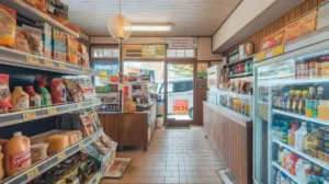
1. Entry Sightlines and Decompression Zone
The entry sets pace and perception. Good visibility relaxes decision-making and immediately tells shoppers where to go for coffee, beverages, or quick snacks.
Keep the first 15 to 20 feet open so customers instantly see destination categories and service points. Use subtle floor cues to slow movement just enough for orientation and place hand baskets at the edge of the zone to encourage multi-item trips. Consider door swing, weather mats, and anti-slip finishes to reduce hazards. A defined decompression zone lowers crowding and decision fatigue, improving flow into the primary loop that follows.
- Clear first view: Show coffee, beverages, and service counter immediately.
- Basket placement: Position within arm’s reach without blocking entry path.
- Floor cues: Use texture changes to suggest direction and pace.
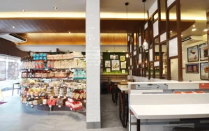
2. Racetrack Layout and Intuitive Adjacencies
A simple loop prevents dead ends and ensures exposure to high-margin categories without adding steps or confusion.
Build a track that guides shoppers past the most profitable sections in a logical order. Pair coffee with bakery, beverages with salty snacks, and quick health items along fast-trip paths. Maintain generous turning radii and avoid narrow choke points that cause hesitation. This approach keeps traffic moving while increasing time spent in the zones most likely to add incremental units to each basket.
- Logical pairs: Place products that are commonly bought together.
- No dead ends: Keep the loop continuous to maintain momentum.
- Wide turns: Prevent cart jams and awkward reversals.
3. Power Wall and Rotating Feature Endcaps
Your first-visible wall and endcaps carry the story of the moment. Rotation keeps regulars interested and trains them to expect something new.
Dedicate the first-visible wall to hero items tied to seasonal needs or dayparts such as morning coffee or afternoon snacks. Change feature endcaps weekly or biweekly and track attach rate per theme. Use simple visual rules for blocking and sign placement so resets take minutes, not hours. Consistent rotation signals freshness and reinforces brand character without confusing navigation.
- Hero placement: Put seasonal or premium items on the first wall.
- Reset cadence: Schedule weekly themes and measure attach rate.
- Fast changes: Design endcaps to swap quickly with minimal labor.
4. Layered Lighting for Product Emphasis
Lighting drives safety and selling power. Layered plans help shoppers see clearly and notice premium items without glare.
Combine bright ambient lighting for navigation with focused accent beams on new, fresh, or premium products, measured as illuminance in lux. Use neutral white around food to enhance appeal and slightly warmer tones near café seating to encourage comfort. Confirm illuminance levels and aim angles during commissioning to avoid harsh hotspots.
- Ambient plus accent: Ensure safe travel and product emphasis simultaneously.
- Color temperature: Neutral white for food, warmer for seating areas.
- Glare control: Aim beams to highlight without washing out labels.
5. Foodservice Bay Layout and Queue Design
Foodservice is a profit engine that demands clarity. Good lines and clear menus reduce friction and increase add-ons.
Separate hot and cold lines, keep prep visible, and place large menu boards above eye level for quick scanning. Use a snake queue to increase exposure to small-ticket rails without blocking circulation, and position quick-grab condiments just past payment to avoid bottlenecks. Many big interior design companies apply this kind of spatial logic to improve throughput while boosting small add-on sales that meaningfully impact overall margin.
- Visible prep: Build trust with clean, transparent production areas.
- Snake queue: Increase exposure to high-margin impulse items.
- Menu clarity: Keep boards readable from several meters away.
6. Wayfinding, Category Signage, and Price Communication
Clear signs and price cues reduce hesitation. Consistent message hierarchy keeps the trip fast and confident.
According to Shopify’s planogram facings data, adjusting shelf facings and product heights based on sales velocity can improve findability and reduce dwell time, leading to quicker, more confident shopping decisions. Install large, readable category blades aligned perpendicular to sightlines and pair clear price tags with promotion callouts. Where pricing changes often, consider digital labels to cut labor and errors. Keep hierarchy simple, category first, then promo, then price.
- Readable blades: Ensure clear category names from aisle approaches.
- Price clarity: Avoid sticker clutter and mismatched promos.
- Digital labels: Use where frequent changes justify investment.
7. Durable Materials, Finishes, and Easy-Clean Surfaces
Materials determine maintenance burden and longevity. Durable choices protect brand consistency and safety over time.
Specify non-slip floors, anti-scuff wall bases, and stain-resistant counters to withstand carts, deliveries, and frequent cleaning. Choose finishes that tolerate cleaning agents and high traffic without fading or chipping. Prioritize lifecycle cost over first cost so replacements are rare and predictable. Durable, easy-clean surfaces maintain a consistent look that customers trust while lowering total cost of ownership.
- Non-slip floors: Reduce incidents and insurance exposure.
- Tough bases: Protect walls from carts and deliveries.
- Stain-resistant tops: Keep counters presentable between cleanings.
8. Data-Driven Planograms and Micro-Resets
Shelf layout should reflect what customers actually buy. Small, regular changes sustain attention and lift attachment.
Use POS and heat maps to set shelf heights, facings, and adjacencies. Keep top sellers at hand height and test seasonal facing changes with simple A-B comparisons. Schedule micro-resets weekly or biweekly so regulars notice novelty without losing their bearings. Monitor basket composition before and after each change, then standardize the combinations that perform best.
- Hand-height heroes: Place top sellers where reach is easiest.
- A-B tests: Compare facings and record attach-rate differences.
- Reset calendar: Maintain freshness without confusing regulars.
9. Safety, Accessibility, and Loss Prevention Sightlines
Safety and shrink control must support, not undermine, a welcoming experience. Visibility is the common thread.
Set aisles to the 36-inch clear width so every shopper can move comfortably while staff maintain sightlines. Keep fixtures low near entries, remove blind spots, and maintain camera-friendly lighting. Use mirrors or convex views to restore visibility in tight corners without feeling intrusive.
- Low fixtures: Preserve visibility from entry to checkout.
- Clear routes: Maintain comfortable aisle widths for all shoppers.
- Smart mirrors: Eliminate blind spots without barriers.
10. Seasonal Resets and Localized Assortments
Relevance drives repeat visits. Seasonal themes and local favorites keep the offer fresh without disorienting regulars.
Build a 12-month reset calendar tied to holidays, weather, and community events. Reserve flexible bays for localized items while keeping core brand blocks consistent. Promote daypart missions like morning coffee or road-trip snacks to frame add-ons that match intent. This approach blends predictability with novelty and strengthens neighborhood connection.
- Calendarized themes: Plan resets ahead to coordinate labor and supply.
- Flexible bays: Mix local favorites without breaking core navigation.
- Daypart framing: Present bundles aligned to morning and afternoon needs.
How Ark & Mason Turns Convenience Store Interior Design Into Results
This section connects strategy to execution, showing how a partner organizes research, prototypes, and rollouts that protect uptime and budget discipline.
Ark & Mason connects strategy to execution through commercial interior design, where our environments practice integrates planning and delivery into one seamless workflow. We begin with discovery using POS by daypart, heat maps, dwell observations, and competitor scans. Then we prototype racetrack or hybrid layouts, validate sightlines in 3D, and translate findings into build-ready packages. To align stakeholders and de-risk changes, we provide visualization and documentation that make expectations explicit.
- Discovery first: Turn data into clear layout hypotheses.
- Prototype fast: Visualize choices to align teams early.
- Measure outcomes: Track conversion, basket size, and queue time.
Why Ark & Mason Delivers Superior Convenience Store Interior Design
Here is why results scale. Our system emphasizes disciplined testing, practical playbooks, and post-launch accountability.
Ark & Mason sustain gains with A-B endcap tests, merchandising micro-resets, and after-action dashboards that attribute lift to specific changes in convenience store interior design. Store-hour friendly phasing reduces downtime, while regional playbooks preserve brand consistency without losing local relevance. Our team manages risk with QA checklists, commissioning support, and clear turnover packages so improvements repeat reliably across sites.
- Test discipline: Prove what works before scaling chain-wide.
- Operational playbooks: Enable fast resets that staff can sustain.
- Accountable dashboards: Attribute lift to specific design choices.
Watch more: Top 10 Interior Design Companies Vancouver BC
FAQs: Convenience Store Interior Design
1. How large should the decompression zone be at the entrance?
Aim for 1.5 to 2.5 meters of clear space just inside the door. This short pause helps shoppers adjust, reduces decision fatigue, and sets a calmer pace for the trip. A defined zone also improves safety by minimizing entry congestion during rush periods.
In a compact urban store, a 2-meter zone paired with a left-turn floor cue can channel traffic into a racetrack loop. Place hand baskets at the zone’s edge to encourage multi-item trips without blocking the doorway or the initial sightline.
2. What lighting levels work best over foodservice and coolers?
Target comfortable ambient levels with brighter accent lighting on fresh and premium items. According to LED efficiency data from the U.S. Department of Energy, LEDs use at least 75 percent less energy and last up to 25 times longer than incandescent lamps, so you can raise accent levels without exceeding circuit capacity or inflating operating costs. Neutral-white tones keep food visually appealing, while glare control protects visibility and camera performance. Balanced illumination reduces eye strain and supports longer dwell where it matters.
For example, brighter accents on bakery displays draw attention to freshness, while consistent ambient levels in beverage aisles help shoppers scan quickly. If you upgrade fixtures, validate efficacy, color rendering, and maintenance needs before rollout.
3. Where should impulse zones sit for maximum lift?
Place small-ticket add-ons along the snake queue and at the final approach to payment. Keep items hand-height and group by mission, like snacks with cold beverages. Clear price communication encourages quick yes decisions without delaying the line.
Try a 4-week test rotating themes like back-to-school, road-trip snacks, and local favorites. Track attach rate and average units per basket before and after each rotation. Use the best performer as the default during your highest volume daypart.
4. How do I balance security with a welcoming atmosphere?
Maintain open sightlines from entry to the counter with low fixtures near doors. Use evenly distributed lighting to avoid shadows while protecting camera clarity. Mirrors or convex views can remove blind spots without feeling intrusive.
If theft spikes at a corner bay, lower fixture height and shift premium items within staff visibility. Minor layout changes often reduce shrink more effectively than heavy-handed barriers, preserving the warm, fast, and friendly feel customers expect.
5. What payback period is realistic for a modest refresh?
Many stores see meaningful movement within 3 to 9 months, depending on scope, traffic, and execution quality. Lighting upgrades and endcap rotations usually recover fastest, while full fixture changes take longer. Consistency in resets is critical to compounding results.
A practical path is pilot, prove, then roll out: refresh one site with lighting, queue rails, and two themed endcaps. If conversion and attach rate rise for six consecutive weeks, adapt the playbook across more stores. Track labor hours alongside sales so ROI reflects true operating impact.
Conclusion
Strong convenience store interior design aligns sightlines, simple loops, and clear communication so shoppers move confidently and baskets grow. Ark & Mason delivers layouts, lighting, and merchandising that compound gains through disciplined testing and easy-to-maintain resets. Our team models options, visualizes choices, and orchestrates rollouts that protect uptime and budget. Ready to turn ideas into measurable results? Contact us to plan your next store refresh.